Dutch consumer group Consumentenbond conducted the two-part and quantitative survey in February this year. For the qualitative survey, it interviewed 16 individuals while 1,056 consumers completed an online survey for the quantitative data.
Published last week, the survey found that over half of those questioned (51%) said they would like to see the UK’s traffic light scheme on the front of food package while 29% chose France’s Nutri-Score and 8% chose the Nordic region’s Keyhole.
It found that, overall, consumers feel positively about front-of-pack nutrition schemes, with 71% thinking they are a good idea. Just over one fifth (22%) are neutral while 5% do not think it is a good idea.
“Food packaging is a sales pitch,” said Consumentenbond. “We call for clarity on the front of the packaging. Consumers are entitled to that information, which allows [them] to see at a glance how healthy - or unhealthy - a product is.”
Babs van der Staak, communications officer at Consumentenbond, told FoodNavigator it presented the findings of the survey to members of the Dutch House of Parliament, who were "very positive".
"Consumentenbond prefers a logo with a traffic light, because the survey shows that this is what consumers prefer," van der Staak said. "But we think the government should do further research to see what logo is best for Dutch consumers. This could be The French or the British logo or maybe a combination of both."
A majority of consumers agreed that they should be implemented by an independent organisation, all manufacturers and supermarkets should participate and – unlike the Nordic countries’ Keyhole logo – the chosen logo should appear on all products, not just healthy or healthier products
A useful logo must be time-saving, conveying the relevant information “at a glance”, they said. “In the case of dairy products, it would not be necessary to open the door of the refrigerated shelves,” they suggested.

A strong majority (74%) said an independent body was necessary to implement the scheme as manufacturers were not credible. “They will always give their products higher scores than they deserve.”
Traffic light
The respondents said the traffic light logo’s strong points were its easy-to-read and eye-catching colour scheme with the numbers giving more in-depth information at a closer look.
However, some said it had too much information. The fact that nutrition information and recommended daily intakes were calculated per portion size was also seen to be confusing. One respondent said: “Per portion? A portion of 150 ml is difficult to calculate, and one person eats bigger portions than another. Stick to 100 ml.”
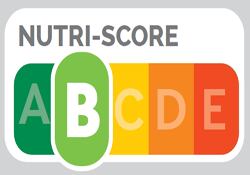
NutriScore
Nutri-Score was rated positively because it was similar to Europe’s energy label and therefore easy to understand.
It was “helpful that the score is calculated for you”, said one respondent.
Consumers said they appreciated the range of the weighting factors, meaning “the composition of the score appeals”.
However, one weak point was its lack of transparency. “The scheme itself does not show what the score is based on,” the report says. “Showing the factors that were analysed for the score is important for credibility and for complete picture.”
One individual said: “[There are] clear association with energy label, but what arguments were used?”
The Keyhole logo was rated poorly overall for its lack of information and being too simplistic and general. “I find it unclear, it gives me very little information,” said one. Others expressed scepticism due to its resemblance to a quality logo rather than a nutrition label.
Choices logo
The Netherlands has a voluntary logo known as the Choices logo or Vinkje (tick) but last June the government announced it was to be phased out by October 2018.
Although backed by the Dutch government and European Commission, the Choices logo was a private initiative with food manufacturers paying a fee to become a member and use the logo.
Consumentenbond had campaigned against the Choices logo, saying many products with the logo were high in salt, sugar and fat, it said – Chocomel’s skimmed chocolate milk, for instance, had a green tick on its pack despite containing the equivalent of six sugar lumps per 250 ml glass.