PureOaty’s ‘new look’: If Glebe Farm won the Oatly dispute, why change its branding?
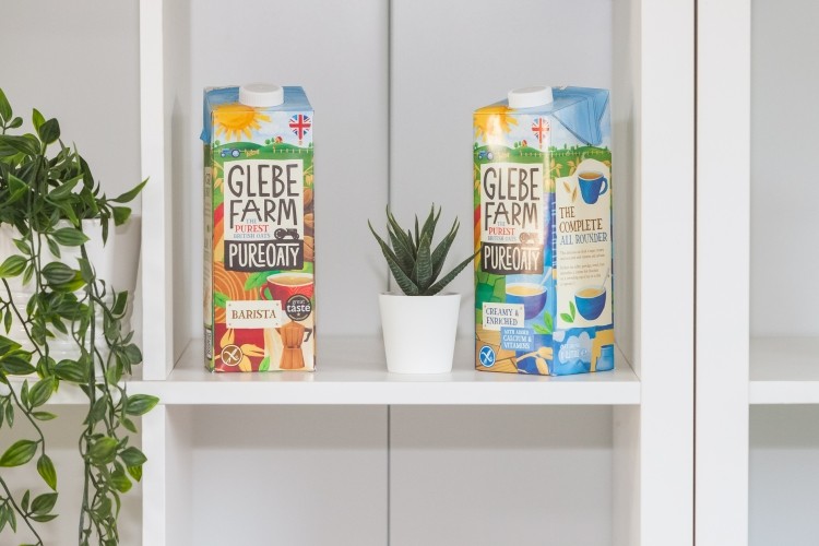
Glebe Farm has a new look. This may come as a surprise to those that followed the Oatly vs Glebe Farm court case last year, in which the former accused the British oat drink maker of trademark infringement.
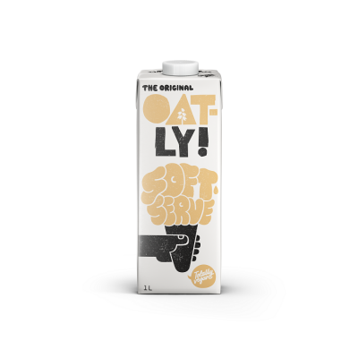
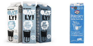
Had Oatly won, Glebe Farm would likely have been forced to change the name of its PureOaty brand, as well as its choice of language and typefaces, use of the colour blue, and detail of a coffee cup on the PureOaty pack.
In August 2021, the judge ruled Glebe Farm, and not Oatly, victorious. This meant that Glebe Farm could continue to commercialise its PureOaty product as is. No design change required.
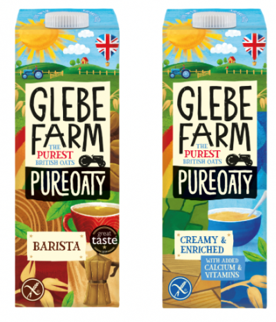
However, Glebe Farm has gone ahead and changed its packaging anyway. Six-months on, consumers will find the oat drink sold nationwide via a new listing in Morrisons. At the same time, the brand is launching an extended range of oat drinks, including ‘barista’ and ‘creamy and enriched’ SKUs.
So how is the packaging different?
The most noticeable difference to the new packaging is that ‘PureOaty’ is no longer the standout text. Instead, the company is pushing its own name: Glebe Farm.
The other major distinction is a newfound stress on being British. This is obviously a distinguishing factor between Glebe Farm and alt dairy major Oatly, which hails from Sweden.
Concerning colour and design, the amount of blue on-pack has significantly reduced. A coffee cup remains the central motif on the ‘barista’ SKU, which is replaced by a cereal bowel on the ‘creamy and enriched’ product.
And a ‘prominent’ QR code has also been integrated into the new design. “Because we utilise renewable energy and are a local business with rock bottom food miles, we have an excellent sustainability story that deserves to be highlighted,” noted the firm. “We have therefore introduced a prominent QR code on pack, to drive to our independently conducted sustainability report featured on our site.”
Why has PureOaty changed its branding?
As Glebe Farm was under no legal obligation to change its packaging, FoodNavigator asked the company why it has made these changes.
“Glebe Farm always thought the court case brought against it by the multinational Oatly was baseless, and it was gratifying that it was so rapidly dismissed by the judge,” explained a Glebe Farm spokesperson.
However, during that time, the British oat drink maker asked its customers about its brand. It realised there was a ‘real opportunity’ to accentuate some of the factors that make PureOaty ‘unique’ in the oat drink market, we were told.
And not only unique from Oatly, but from a ‘whole market that is dominated by foreign exports’, the spokesperson continued.
“First and foremost, we’re an independent, British Family Farm, proud to be growing our own, pure gluten free oats and making oat milk right here in Cambridgeshire. We believe our new fresh packaging for 2022 showcases just that, reflecting our brand ethos and values, even from a quick glance on a shelf.”
Following the Oatly court case, Glebe Farm was ‘of course’ very ‘proud’ to keep PureOaty at the heart of its brand, and still featuring on the front of the pack.
FoodNavigator followed up with Oatly, to hear its take on the rebrand. “We’re glad to see it and think the packaging looks good!” said Ishen Paran, General Manager of Oatly UK. “We wish them well.”
‘A very smart rebrand’
Aside from the obvious, that Glebe Farm could keep its packaging and branding as is, the British company may well have profited from the court case in other ways.
For one, the dispute undoubtedly helped boost Glebe Farm’s profile in the alt dairy category. How having a better-known name translated into sales over the past six months since the case was not revealed, but the business did suggest a significant boost over the past year.
“In regards to sales, whilst we remain a relatively small player in a category dominated by foreign imports, Glebe Farm’s PureOaty has experienced over 50% growth in the last 12 months,” the spokesperson told this publication.
“Our family run business is now focused on broadening distribution to improve opportunities for mainstream consumers to access our oat milk through established grocery channels.”
FoodNavigator also sought the perspective of food and beverage branding expert Eddie Stableford from UK consultancy Brand Clock.
“I believe at the core of the dispute was the use of the word Oaty, which Oatly claimed was likely to cause confusion. So in that respect, the dismissal of the claim was hugely important to Glebe Farm,” he told this publication.
The ‘new look’ has worked to strengthen its branding, Stableford suggested. “Not only have they retained this word in their new design, but also strengthened the ‘lock up’ to their brand name which they have increased in dominance. In this respect, they have cemented the ‘brand ownership’ of Oaty through the new visual relationship.”
The other aspect worth noting, according to the branding expert, is the increased ‘Britishness’ on-pack. This makes ‘complete sense’, he continued, given the point they rightly make about what makes them unique.
“And of course, post-Brexit (and COVID), many consumers are seeking out British products.
“Overall, a very smart rebrand.”
